この記事は さいが崖 Advent Calendar 2025 10日目の記事です。
shadcn/uiとは?
shadcn/uiはReact向けのコンポーネントライブラリです。もはや一般的になっているCSSフレームワークのTailwind CSSと、React向けのヘッドレスUIライブラリであるRadixがベースになっています。
フロントエンドに馴染みのない方に説明すると、Button, Badge, Calendar, Alertのようなコンポーネントが色々入ってて、すぐUIを構成できるよ~ってヤツです。
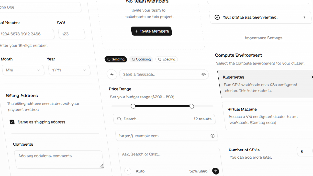
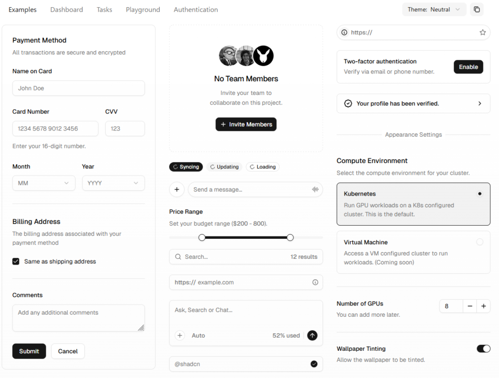
デザインはモダンな感じで、かなり洗練されています。公式ページのサンプルはこんな感じ。
ただし、shadcn/uiはその辺のコンポーネントライブラリの二番煎じではありません。 “Open Source, Open Code” を掲げており、AI-Ready なライブラリであることを特徴としています。
どういうこと?って感じですが、実際に使ってみると納得がいきます。サンプルを見ていきましょう。
shadcn/uiの基本
環境構築は公式HPにしっかり書いてあるので割愛します。今回はVite + React + Typescript環境を前提に説明していきます。パッケージマネージャはpnpmを使用しています。
最低限ボタンを実装してみます。まずButtonコンポーネントを追加して使えるようにします。
pnpm dlx shadcn@latest add buttonこのコマンドを実行すると、 src/components/ui/button.tsx が自動的に生成されます。
import * as React from "react"
import { Slot } from "@radix-ui/react-slot"
import { cva, type VariantProps } from "class-variance-authority"

import { cn } from "@/lib/utils"

const buttonVariants = cva(
  "inline-flex items-center justify-center gap-2 whitespace-nowrap rounded-md text-sm font-medium transition-all disabled:pointer-events-none disabled:opacity-50 [&_svg]:pointer-events-none [&_svg:not([class*='size-'])]:size-4 shrink-0 [&_svg]:shrink-0 outline-none focus-visible:border-ring focus-visible:ring-ring/50 focus-visible:ring-[3px] aria-invalid:ring-destructive/20 dark:aria-invalid:ring-destructive/40 aria-invalid:border-destructive",
  {
    variants: {
      variant: {
        default: "bg-primary text-primary-foreground hover:bg-primary/90",
        destructive:
          "bg-destructive text-white hover:bg-destructive/90 focus-visible:ring-destructive/20 dark:focus-visible:ring-destructive/40 dark:bg-destructive/60",
        outline:
          "border bg-background shadow-xs hover:bg-accent hover:text-accent-foreground dark:bg-input/30 dark:border-input dark:hover:bg-input/50",
        secondary:
          "bg-secondary text-secondary-foreground hover:bg-secondary/80",
        ghost:
          "hover:bg-accent hover:text-accent-foreground dark:hover:bg-accent/50",
        link: "text-primary underline-offset-4 hover:underline",
      },
      size: {
        default: "h-9 px-4 py-2 has-[>svg]:px-3",
        sm: "h-8 rounded-md gap-1.5 px-3 has-[>svg]:px-2.5",
        lg: "h-10 rounded-md px-6 has-[>svg]:px-4",
        icon: "size-9",
        "icon-sm": "size-8",
        "icon-lg": "size-10",
      },
    },
    defaultVariants: {
      variant: "default",
      size: "default",
    },
  }
)

function Button({
  className,
  variant,
  size,
  asChild = false,
  ...props
}: React.ComponentProps<"button"> &
  VariantProps<typeof buttonVariants> & {
    asChild?: boolean
  }) {
  const Comp = asChild ? Slot : "button"

  return (
    <Comp
      data-slot="button"
      className={cn(buttonVariants({ variant, size, className }))}
      {...props}
    />
  )
}

export { Button, buttonVariants }
使ってみます。Reactのコンポーネントとして普通に呼び出せます。
import './App.css'
import {Button} from "@/components/ui/button.tsx";

function App() {
  return (
    <div>
      <Button>クリックしてね</Button>
    </div>
  )
}

export default App無事表示されました。

shadcn/uiの設計思想
要するに、使いたいコンポーネントを追加すると、プロジェクト内にコンポーネントのコードが自動生成されるというのが、shadcn/uiの核心となる “Open Code” の設計思想です。
これにより、Github CopilotやClaudeといったAIコーディング支援ツールがコードを把握できます。これがAI-Readyの所以です。デザインの編集に関しても、使用者の多いTailwindがベースになっているのでデザインの微調整も容易です。めっちゃイマドキな感じしますね。ナウなヤングにバカウケです。
コードが可視化されているため、渡すpropsを忘れてしまっても大丈夫です。いちいちドキュメントを見に行く必要はなく、コードの該当箇所を見ることで把握できます。
  // Variantの一覧もコード内で確認できる!
    variants: {
      variant: {
        default: "bg-primary text-primary-foreground hover:bg-primary/90",
        destructive:
          "bg-destructive text-white hover:bg-destructive/90 focus-visible:ring-destructive/20 dark:focus-visible:ring-destructive/40 dark:bg-destructive/60",
        outline:
          "border bg-background shadow-xs hover:bg-accent hover:text-accent-foreground dark:bg-input/30 dark:border-input dark:hover:bg-input/50",
        secondary:
          "bg-secondary text-secondary-foreground hover:bg-secondary/80",
        ghost:
          "hover:bg-accent hover:text-accent-foreground dark:hover:bg-accent/50",
        link: "text-primary underline-offset-4 hover:underline",
},ちなみにshadcn/uiのドキュメントはExampleが非常に多いので、Tailwindを把握していなくても触りやすいと思います。Buttonのコンポーネントのドキュメントも一度読んでみてください。
cvaを使ったvariantsの管理
自動生成コードを確認すると、見慣れない関数が使われています。
const buttonVariants = cva( ... )この cva() は Class Variance Authority (以下CVA) と呼ばれるライブラリで、variantsの定義をきれいに纏めるために使われています。Tailwindや生のCSSをそのまま使うのに比べて、可読性が大幅に向上します。Typescriptの型補完にも使えます。

CSS-in-TSでtype-safeなCSSを書くライブラリというと有名なのは Vanilla Extract とかがありますが、書き方がかなりJS寄りになってしまい癖があります。それに比べてCVA + Tailwindの場合は普段Tailwindを使っている感覚とほぼ変わらずvariantを楽に定義できるので、開発体験がだいぶ良いな~という印象です。
CVAについて深堀りし始めるとキリがないのでこれ以上は割愛しますが、このあたりの記事を読むとわかりやすいのでお勧めです。

ちなみに「variantsでTailwindのクラスが競合したらどうすんねん」という心配もありますが、こちらは tailwind-merge が内部的に使われているので安心です。
// cn(...) は自動生成されたユーティリティ関数
return (
    <Comp
      data-slot="button"
      className={cn(buttonVariants({ variant, size, className }))}
      {...props}
    />
)export function cn(...inputs: ClassValue[]) {
return twMerge(clsx(inputs))
}ライブラリのMCP Server…?
shadcnのドキュメントを読むと、MCP Serverの項目があります。AI-Readyとはいえ、そこまでやる……?
WebstormのAI Assistantも最近MCPが使えるようになりました(現在Beta版)。こんな感じで設定しておきます。
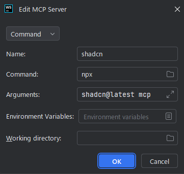
AI Assistantのチャット欄からコマンド一覧を表示させると、shadcnのものが追加されています。コンポーネントのaddコマンドとかを確認できるのはとてもありがたいです。めちゃくちゃモダンなライブラリって感じ。

デザインキットも充実
こういう新興UIライブラリの場合、プロトタイプの作成時に「Figmaのデザインキットがなくてしんどいな……」となりがちですが、shadcn/uiは無料2種・有料3種と比較的充実しています。公式のデザインキットではなくコミュニティのものですが、あるとやっぱりうれしいですね。

ちょっとした個人開発なら別にいらないっちゃいらないんですが、やっぱりFigmaで全体像を作っておいたほうが進捗が可視化できるので個人的には好きです。複数人開発とか、デザイン屋さんとプログラマーが別の場合は猶更ですが。
Tailwindベースなのもいい味を出していて、テキストサイズやカラーバリエーションもTailwindの初期カラーに合わせたりできるので開発・デザインどっちの側面からしてもうれしいですね。
まとめ
今回初めて触ってみましたが、デザインをゴリゴリにやる場合を除いて、一般的なWebアプリ開発に関してはもう全部shadcn/uiでいいんじゃない?というレベルの良さを感じました。Tailwind CSSを初めて触った時ぐらいの衝撃度です。大抵この手のライブラリは痒い所に手が届かないことがよくありますが、shadcnは痒い所があったら Open Code なので自分で掻いてしまえ的な強さを感じます。編集してもgitでdiffが確認できるので追跡しやすいですし……。
純粋なコンポーネントの質で見ても、必要十分なコンポーネントがそろっていることに加えて Empty や Kbd のようなピンポイントで欲しいものもあり、デザインも洗練されていてレベルの高さを感じます。
ちなみにReact用のライブラリですが、Vueに移植された shadcn-vue もあります。私はどちらかというとVueのほうが好きなのでこっち使いたい(小声)

直近でElectronアプリの開発をやる予定があるのですが、結構よかったのでshadcnを採用しようかなと考えています。導入も簡単なので、ぜひ一度使ってみてください👍


コメント